Markov Processes International

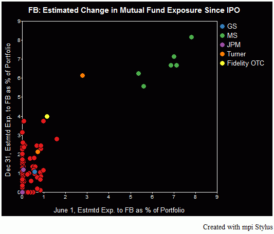
Chart of the Week: FB – Change in Estimated Mutual Fund Exposure Since IPO

As we say “goodbye” to 2012, we turn back to the year’s biggest IPO and history’s largest tech IPO, Facebook (NASDAQ: FB).

The intention of the original post on FB was to see what quantitative analysis of a galaxy of mutual funds using daily data over a very short time period can actually show a savvy fund investor. The applications for such single security detection were mostly for risk management purposes, understanding exposure to a new security whose value was of much debate, as evinced by its stock price.

In this follow-up, we utilize our patented Dynamic Style Analysis (DSA) model to look at how estimated1 exposure to FB has changed from the IPO to the end of the year across the large-cap growth galaxy of mutual funds. The Y-axis shows estimated exposure as a percentage of each fund’s portfolio at the end of the year (to remove noise associated with daily data, we average exposure over the final 2 weeks of the year), while the X-axis shows estimated exposure at IPO (again, average exposure over the initial 2 weeks of trading following May 18th IPO).

In general, we note what appears to be a trend amongst these funds to growing exposure since FB began trading.  It’s worth noting that FB was added to the NASDAQ 100 just prior to the second period under analysis.

Additionally, the continued media attention and coverage of the iconic company’s investor base makes FB a good case to highlight the accuracy of such quantitative analysis. It must be reiterated though that, much like a water reflection on a calm morning that sees occasional wind, this analysis is purely returns-based2 and aberrations are inherent between what shows up in a returns-based model and what fund is actually holding.

As shown in the chart, we highlight all funds listed within the large-cap growth category from the asset management divisions of FB’s three primary underwriters – Morgan Stanley, Goldman Sachs and J.P. Morgan. What the analysis shows appears to generally match what has been reported from a holdings perspective – while there has been selling reported in MS funds, they appear to maintain significant exposure to FB3; GS funds have reported some selling as well but we still see exposure showing up (i.e. GSGCX). J.P. Morgan funds, whom the Wall Street Journal in the above hyperlinked story (from Dec.31st)suggests has sold all of their FB, suggest the only significant aberration in our model and what we’ve seen reported, as exposures aren’t really detected post IPO, though one fund (JGASX) shows some exposure currently.

We also highlight other outliers like Turner Concentrated Growth (TTOPX), whose second largest reported position is FB, and Fidelity OTC (FOCPX), whose third largest holding as of 11/30/12 is reportedly FB.

Again, the insight that investors can ascertain into their funds and portfolios intra-reporting periods utilizing advanced quantitative analysis is striking, and more accessible than many imagine.


Footnotes

Exit mobile version